Covid-19 Shinyapp
The data displayed by this {shinyapp} is taken from Johns Hopkins University Center for Systems Science and Engineering (JHU CCSE). The raw data is available on {Github}. The data is updated on daily basis.
Packages needed for the app:
library(easypackages) # install.packages("easypackages")
libraries("lubridate", "tidyverse", "readr", "plotly")
urlfile="https://raw.githubusercontent.com/RamiKrispin/coronavirus/master/csv/coronavirus.csv"
coronavirus <- read_csv(url(urlfile))
coronavirus <- coronavirus %>%
mutate(month=as.factor(month(as.POSIXlt(coronavirus$date, format="%Y/%m/%d"))))
countries_list <- c(levels(as.factor(coronavirus$country)))
Months <- c(levels(coronavirus$month))Overview of 2020
selectInput(inputId = "Ctr",
                        label = "Country of interest",
                        choices = countries_list, selected = "Germany")


 checkboxGroupInput("type_dat", "Type",
                    choiceNames=c("Confirmed", "Death", "Recovered"),
                    choiceValues = c("confirmed", "death", "recovered"),
                    selected = "Confirmed")

dat_Ctr <- reactive(
   coronavirus %>%   filter(   (country %in% input$Ctr) & (type %in% input$type_dat) )
   %>% group_by(month, type) %>% summarise(cases=sum(cases))

)
 renderPlotly({
   validate(
        need(input$type_dat, "")
      )

   dat_Ctr() %>% ggplot(aes(month, cases, color=type, group=type))+
     geom_point()+  geom_line()+ theme_bw()+
       theme(text = element_text(size=20))+
     facet_wrap(~type, scales = "free", nrow = 2,
                labeller = labeller(
        type = c("confirmed" = "Confirmed", "death"="Death",
                 "recovered"="Recovered")) )+
        theme(legend.position = "none")+
     theme(axis.text.x = element_text(size = 12, face="bold"),
    axis.text.y = element_text(size = 12, face="bold"))+
     xlab("Month")+ ylab("Cases")

   })
Year Overview
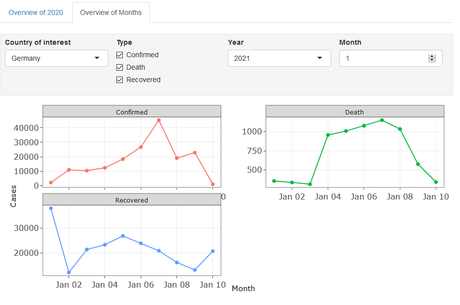
Overview of Months
selectInput(inputId = "Ctr_",
                        label = "Country of interest",
                        choices = countries_list, selected = "Germany")

checkboxGroupInput("type_dat_", "Type",
                    choiceNames=c("Confirmed", "Death", "Recovered"),
                    choiceValues = c("confirmed", "death", "recovered"),
                    selected = "Confirmed")


numericInput("obss", "Month", max(as.numeric(as.character(coronavirus$month))), min = 1, max = 12)

dat_Month <- reactive(
   coronavirus %>%
filter(   (country %in% input$Ctr_) & (month %in% as.character(input$obss)) & (type %in% input$type_dat_))%>% group_by(date, type) %>% summarise(cases=sum(cases),  month=unique(month), type=unique(type)) )

 renderPlotly({
   validate(
        need(input$obss, "")
      )
    validate(
        need(input$type_dat_, "")
      )

dat_Month() %>%  ggplot(aes(date, cases, color=type))+
   geom_point(aes(shape=month))+ geom_line()+
  theme_bw()+
  facet_wrap(~type, scales = "free", nrow = 2, labeller = labeller(
   type = c("confirmed" = "Confirmed", "death"="Death", "recovered"="Recovered")) )+
  theme(legend.position = "none")+
    theme(axis.text.x = element_text(size = 12, face="bold"),
      axis.text.y = element_text(size = 12, face="bold"))+
     xlab("Month")+ ylab("Cases")

   })
Overview of months